Date:
Jan 4, 2026
Category:
Education
Volume Extremes and Footprint Analysis in Order Flow

Welcome back to the blog - last time we looked at a few different ways traders can visualize volume in order flow trading. If you missed it, you can read it here.
A quick review of the different types of analysis we looked at:
Basic Volume Analysis: where is volume rising and falling relative to time?
Volume Analysis by Price: how much volume has been done at a given price level.
Delta Analysis by Price: Same as volume profile, but looking at aggression per price level.
Footprint Charts: A granular look at each price level within a given time frame and how much volume/delta was done at each level.
So now that we know some of the main tools available to us - how do we filter out some of the noise to focus on the areas that are important that could help us place high probability trades?
Think of the market like tuning a radio (you young people are gonna have to look this one up). In between channels is static and confusion. Our job as traders, is to tune the radio station to something clear and useful.
So what are we looking for? Anomalies. Areas where something that was happening isn't any more, something that should have happened and didn't, or something that wasn't supposed to and did. Examples include:
- A candle with huge volume that has half the range as another candle with similar volume.
- A candle that breaks through the previous day high with less volume than the candle prior to the break.
- A candle with twice the range of other nearby candles.
And the list goes on and on.
To illustrate let's start with simple volume analysis and then zoom in to see the mechanics of what's happening.
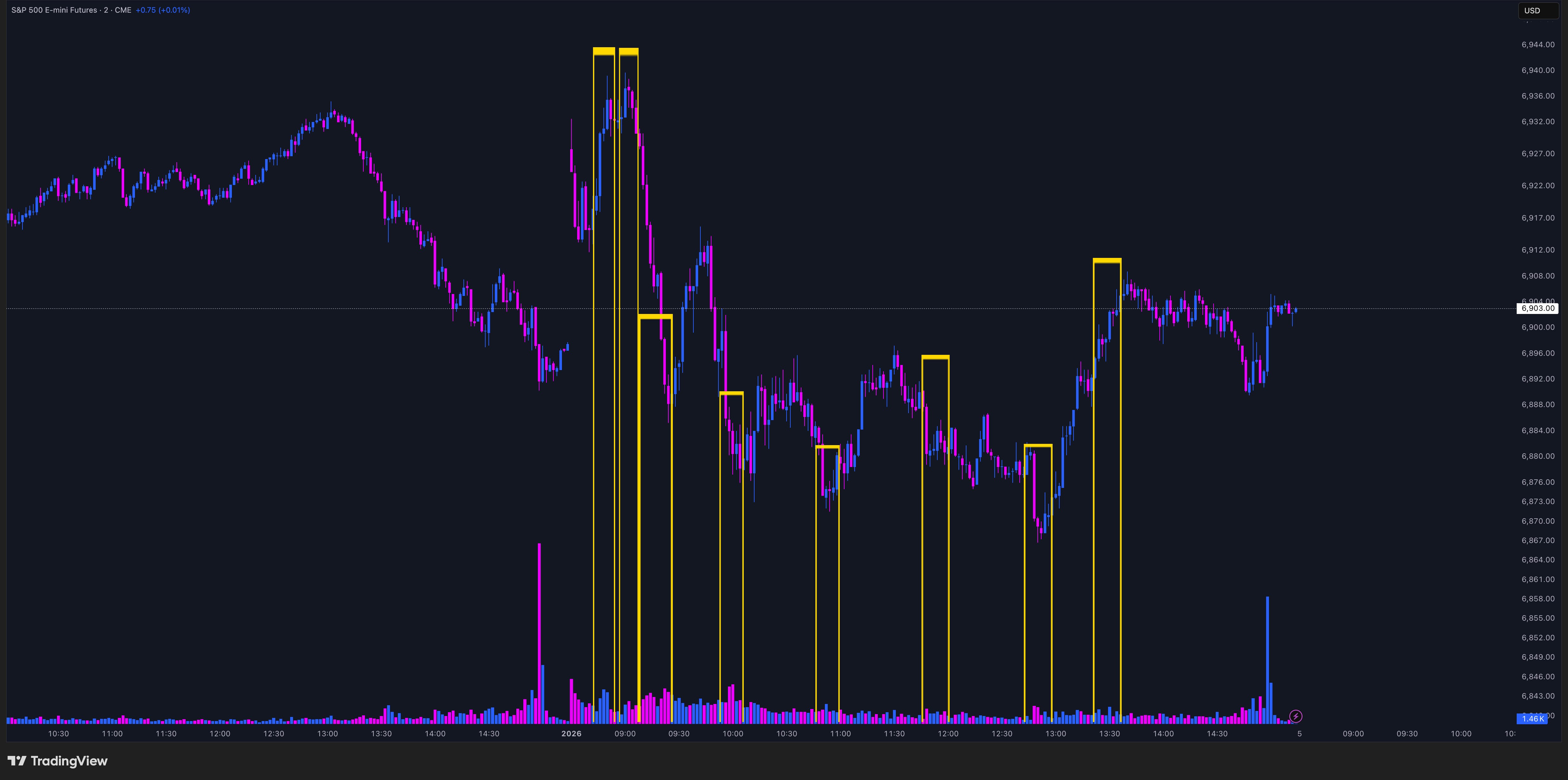
Above I have a 2 min chart on the S&P Futures on Friday, January 2nd 2026 - we're looking at the regular trading session. I manually drew boxes around the high volume areas that stuck out to me on the chart (ignoring the open and close times which always have elevated volume). You can see that just by circling these areas that they're some of the most interesting times of the entire session. Most were at a moment when the market changed direction or marked a local high or low.
While this analysis works, it's usually much easier to do in hindsight because I know how much those areas of volume stand out once I can see the entire session, but I don't know that in real-time. I'm also marking quite a few areas, so let's try to narrow down what we're looking a bit more.
Below, I have the same chart as before with the addition of red and green dots. None of you non-coders get scared and quit reading, I'm gonna make this simple for you and I promise this won't be a coding tutorial.
I want a way to quantify what constitutes "interesting" instead of just circling by eye. I write code that says, "Hey, I want to look at the volume and range of the last 9 bars and give me an average - we'll call those averages AverageVolume & AverageRange."
Great, now let's draw something, "Every time the volume and range are greater than their average, I want you to draw me a dot. If it happened on a positive candle, draw me a red dot, and if it's a negative candle draw me a green dot."
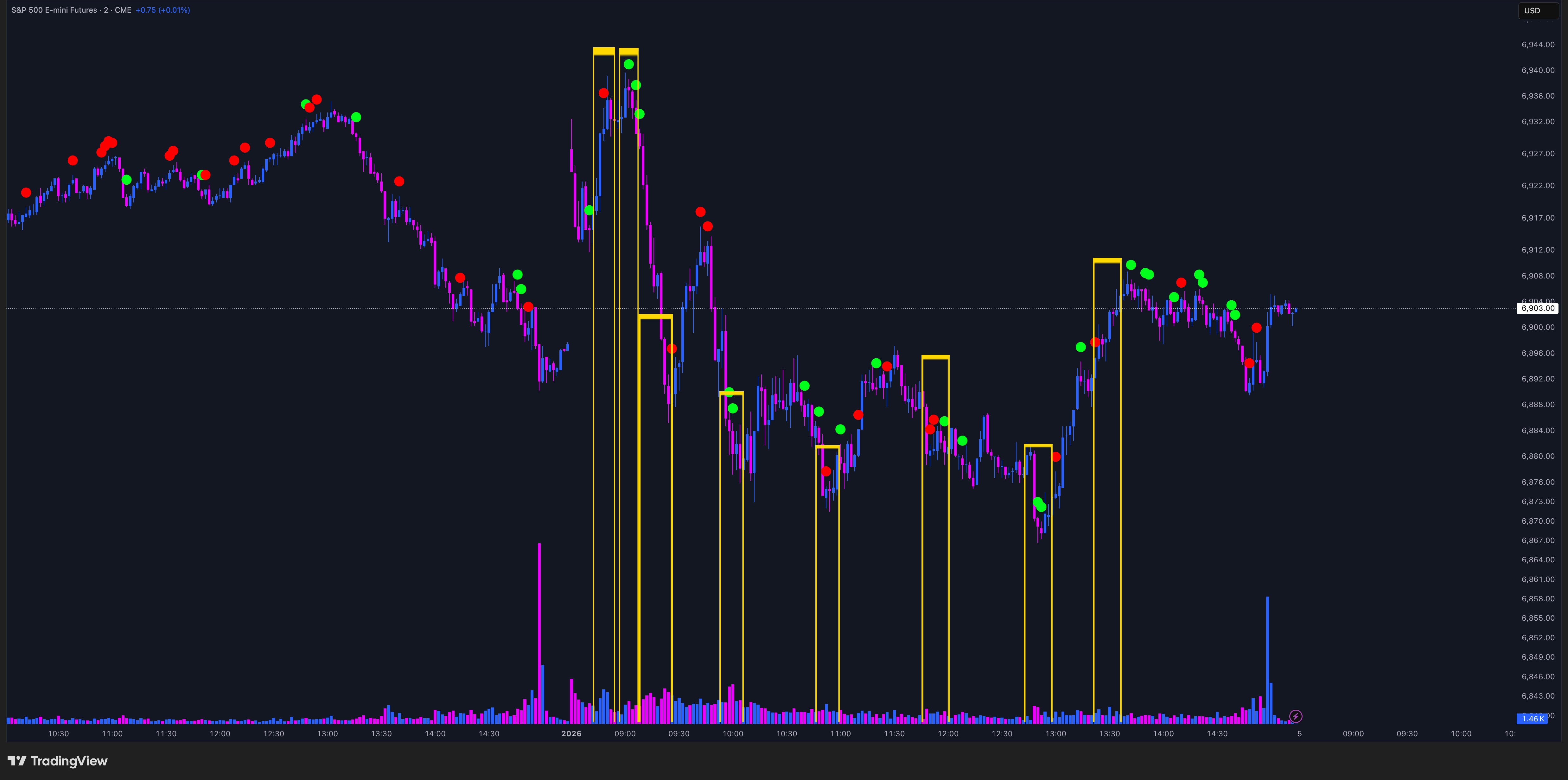
Too many dots - that's not doing me any favors to narrow down where I should be paying attention. But if I squint, I notice that it is still showing me dots in a lot of the manual yellow boxes I've drawn. That's a start.
Let's focus even more - "Okay, I want the same drawing, but I now want to show areas where the volume was 1.5x the average, but the range was still just average because that seems different than what usually happens."
Now I've gotten somewhere. Dots still in my manual areas of interest, but only a few, and in much more actionable areas. Each marking tradable highs or lows. What we're highlight is absorption. Price is trying to move up or down, but buyers or sellers are passively buying or selling, slowing the progress - actionable information especially when it gets extreme.
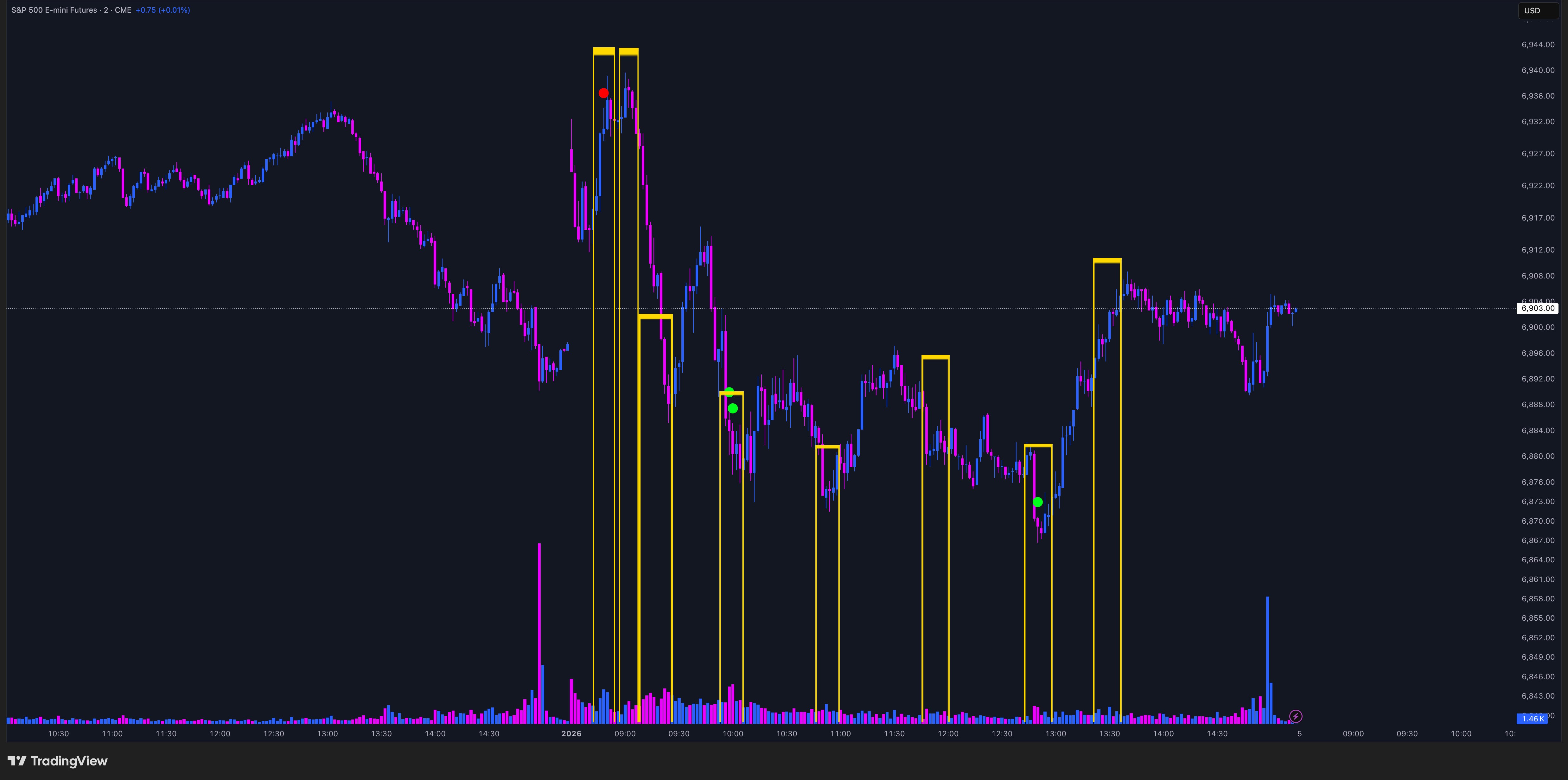
As a last part of this exercise, I'll zoom further to the same 2 min chart using a footprint chart in MotiveWave (called Volume Imprint in their studies). To help orient yourself. The candle with the red dot above it is the same candle with a red dot on it in the TradingView screenshot above.
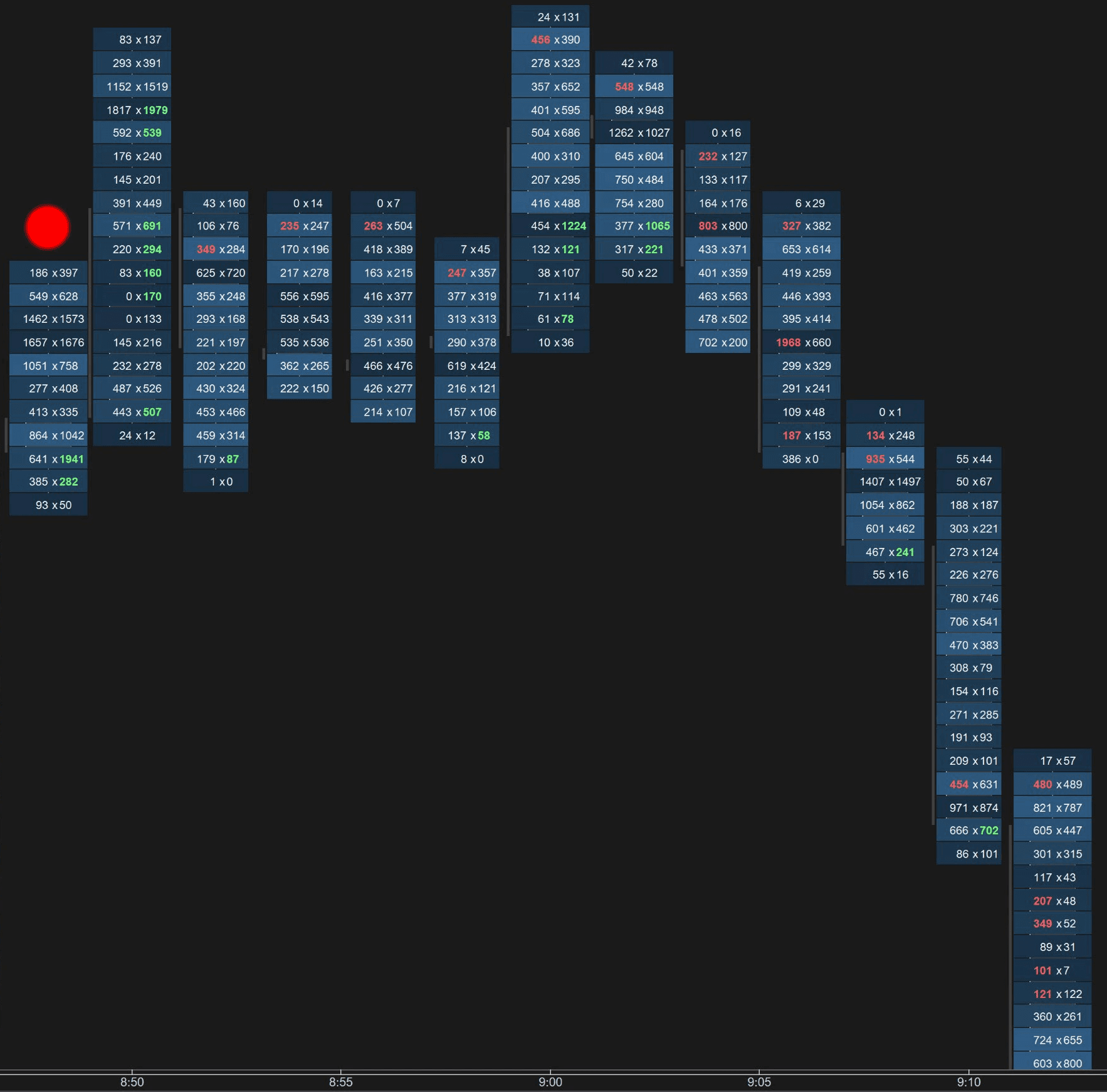
Foot print charts look intimidating at first, but I'll make it simple for you. The numbers themselves represent the # of contracts traded at the bid (left number) and the ask (right number).
Let's zoom in to the candle with the red dot above it and focus on the green text at the bottom of the candle:
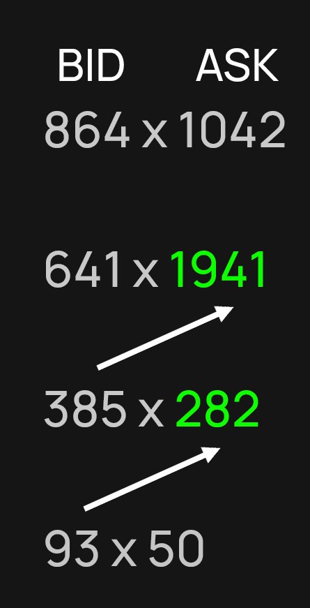
Like a book, you read the footprint left to right, but unlike reading a book, you read up and to the right to look for imbalances. In this case, I'm looking for times where the ask volume is at least 300 percent higher than the bid volume and highlighting the text green when this happens - a buying imbalance. If the opposite is true, it is highlighted red for a selling imbalance.
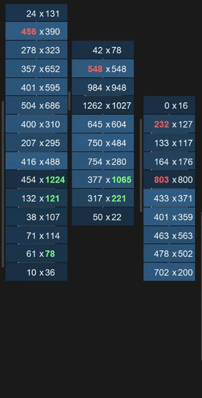
Let's focus on just the red and green numbers and where they're located in their respective candles. On the left side of the chart, you have strong buying imbalances throughout the candles and the volume totals near the tops is quite high, buyers willing to buy thousands of contracts at the high of day - very bullish.
Then we notice a change in behavior. Buying imbalance disappears for the next few candles, and the volume, particularly near the high of the candles, starts to get much lower. We also notice some selling imbalances pop up, more interest in selling into the bid rather than buying higher prices.
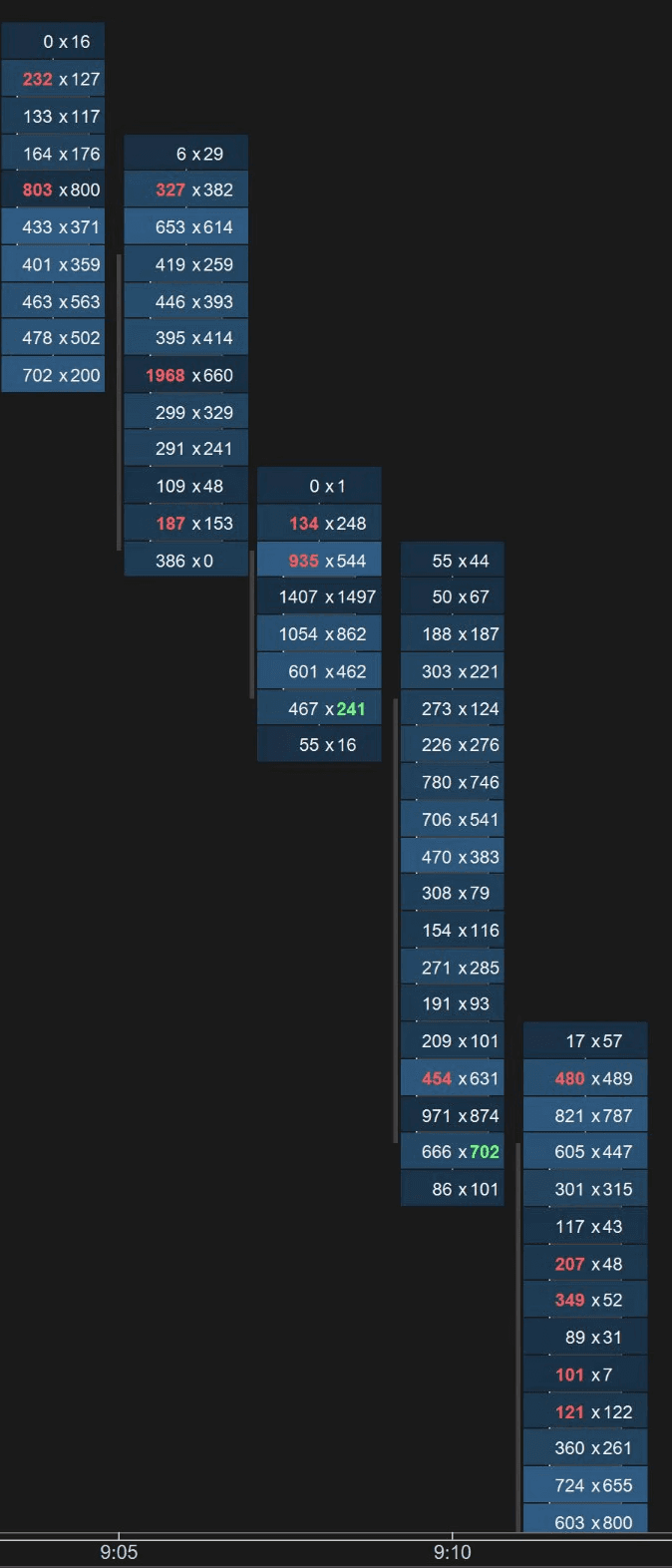
Right after 09:00AM, we see some initiation again from the buyers, but notice that they're buying dips as the green imbalances are close to the low of the candles. Buyers are not willing to pay higher prices and we're getting sell imbalances near the tops again - anomaly, change in behavior from the move up.
Right before 09:05, there are two candles in a row with at least two sell imbalances and notice how low the volume is at the tops now (there's even some 0s), buyers are having a hard time selling at higher prices. 5 minutes later, we get a huge liquidation to the downside as panicked buyers who bought the highs look for an exit.
Anomalies create trading opportunities.
None of this requires catching every top or bottom, only recognizing changes in behavior and managing risk to capitalize on it.
In the next blog, we'll focus on spotting exhaustion and what it means for order flow traders.
Author

Zack
Lead Developer

